Costly Problems When Printing
There are a variety of costly problems that can occur when printing your files. Often, these problems come about from simply not having print knowledge, which is to be expected! After all, that is why we have a prepress department that prepares your files for print. However, if you want to look into potentially saving some costs, here are a few tips you can look at and follow for your next project.
Errors with the Design File Itself
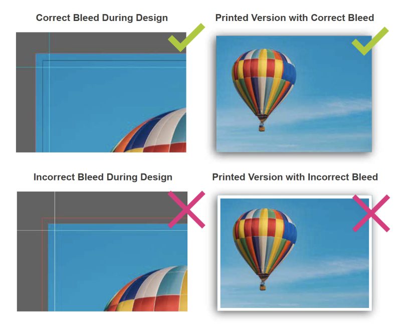
Something we commonly see is that there is no bleed in the file, or if there is bleed, the colors of the file still do not go to the edge. Take a look at the image below which illustrates this. The parts with the green checkmarks indicate that the image goes all the way to the edge with the red line (the bleed). The parts with the pink X indicate that the file is likely to print incorrectly and not to the edge of the file.
Take a look at our YouTube video which explains how to add bleed to your InDesign documents.
Something else to look out for is whether your images and logos are high-quality. For logos, it is always best to use vectorized images if you have them.
RBG vs. CMYK Colors
Colors are colors, and it doesn’t matter which ones you use in your file, right? Well, not exactly. There is a difference between colors for the screen and colors for print. Many who have never worked with print often do not know this! One of the most common costly problems for our clients is that their file contains RGB colors (colors meant for the screen) instead of CMYK colors (colors meant for print). Check out our YouTube video on how to switch the links in your InDesign document from RGB to CMYK.
To summarize, when working with your file, make sure your background colors, images, etc. are all CMYK colors. This will prevent you from being surprised when you receive your printed files only for them to have slightly “off” coloring. Our prepress department will usually catch this error before print, but it is always best to have the files CMYK-ready if possible.
Choosing the Wrong Type of Stock
There is a reason different paper stocks exist: some are better for certain purposes. Unfortunately, picking the wrong one can give your audience the wrong impression of a product or service, or it can be not as practical for what you want it used for.
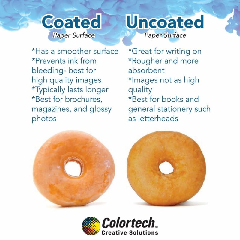
To keep it simple, you mostly want to decide whether you want your stock to be coated or uncoated. Coated paper stocks work best for brochures, catalogs, and magazines since this type of stock is often crisper, providing the best type of canvas for fine details. On the other hand, uncoated paper stocks are often best for business cards, letterheads, and invitations. They are much easier to write on due to their being more porous, and they give off a good tactile impression.
Colortech’s team can help you figure out which stock is best for your project since this can be a confusing process. We’ll give you the best option for your budget!
Inconsistent Materials
This works alongside the previous point of choosing the wrong type of stock for your project. When you’re working with many different materials for your brand, you want to make sure you are giving off the same type of messaging in every printed product. This includes the type of stock you use and your colors. You don’t want to use a coated stock for one brochure and then an uncoated one for your next. This gives off the impression that you don’t pay attention to the finer details, and your colors will also be negatively affected. While you may not think people will notice, they absolutely will.
Inc. Magazine’s article “7 Costly Mistakes Print Design ‘Experts’ Make” said it best: “Inks, stocks, coatings, and imprint methods all affect your color. Colored stock can show through ink, changing colors. Coatings can change brightness and hue. Textured stock adds depth which reflects light differently.”
No matter which stocks, colors, and coatings you find appropriate for your business, make sure to keep them consistent!
Textual Errors
Finally, it is possible to have costly errors with something that has nothing to do with the printing process at all: the type and the images you use. When you use the wrong images or have typos and don’t catch them until after printing, you’ll have to spend more to get it reprinted. Always spell-check and double-check all images before sending your documents to print!