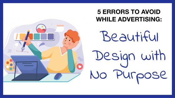
5 Errors: Beautiful Design with No Purpose
Welcome to the second post in our blog series, “Five Errors to Avoid While Advertising”. This series will guide you on what you can look out for while putting your marketing together for your business. Some mistakes are unavoidable and must be learned on an individual basis. On the other hand, there are some that many companies tend to make with their marketing that could be avoided. For our second error, we will discuss how companies can make a beautiful design for their advertisements but offer nothing about what the advertisement is for.
The way your advertisements are designed is absolutely important; after all, it is the first thing people will notice about your brand and hence your company. You definitely want to have a flawless design that pops and sticks in people’s minds.
However, you cannot rest merely on looks alone. Your ad needs to accurately sell your product or service. It should stand out not only in aesthetics but in the quality of what you produce. If people don’t understand what it is that you are marketing for, then your efforts will all be for naught. Our marketing department can always help you figure out what you want to accomplish.
Make it very direct with what exactly you are advertising, especially if your business is just starting out.
Example #1: 1st Bank
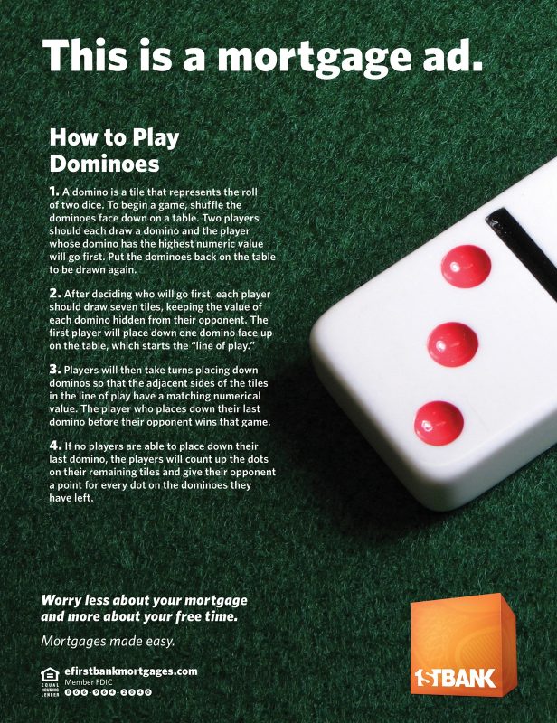
The example above is a 2013 magazine advertisement from First Bank, stylized as 1st Bank. This specific ad demonstrates how a design can be aesthetically pleasing but not have much else to it.
The idea behind this ad is to “worry less about your mortgage and more about your free time”. First Bank is demonstrating a service it provides to its customers in this way. Rather than allowing them to stress over mortgage payments, First Bank offers its customers simple solutions and great customer service. This is a good message for a company to demonstrate and can certainly be used in a creative way.
Using the ad space by talking about a fun topic is not a bad idea. If anything, it can make you and your business stand out and be memorable.
However, there is a lot of text in this ad. How often do people really want to look at a block of text? This is especially true when it does not pertain to the service you provide as a company. People might miss the point you are trying to make and get confused.
The idea of this ad is definitely there, but the company could have done something slightly different. What it is advertising isn’t exactly comprehensible simply by looking at the design. First Bank could have made the title, “Worry less about your mortgage” with the text, “Learn how to play dominoes instead” underneath in the grass beside the domino. These small edits would have made First Bank’s message much clearer and would have made the audience more likely to look at it.
Most people do not have the time to read several paragraphs of text for an advertisement they can easily skip over. It is a great idea to make your advertisements clever and memorable. At the same time, make them easy to read and understand.
Example #2: Taco Bell
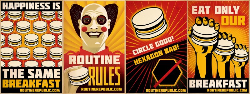
In 2015, Taco Bell came out with a new line of breakfast foods for its menu. The fast-food franchise wanted to promote these new items. How did they choose to do this? By openly making fun of its famous fast-food competitor, McDonald’s, and the sameness in which it presents its food and experience to the American public. The company chose its advertising method upon the assumption that people grow tired of having the same things.
Taco Bell featured these posters in a 2015 commercial. The commercial features a dystopian environment called “Routine Republic”. All citizens line up every morning and receive a sad-looking breakfast sandwich. Two teenagers decide to rebel and run away from the dreary atmosphere and propaganda posters to the bright, hopeful world that Taco Bell provides.
So, what is wrong with all of this, you may ask? The print advertisements seen above have great designs. They have a great color scheme, a clear focal point, good typography, and use illustration extremely effectively. To put it simply, these capture your attention and are incredibly memorable.
There are three main issues at hand here.
- The ads do not mention Taco Bell at all except at the very end of the three-minute-long commercial. Even in the print advertisements above, there is no reference to the company in the slightest. They instead use a website tied only to the campaign (this website is now invalid, with its domain available to purchase).
What is the purpose of basing your campaign on another company’s ideals only to not include your own company in the design at all? This is a perfect case of a beautiful design with seemingly no purpose. How will people know to try out your breakfast as opposed to a competitor’s if they don’t know that you are the one putting out the advertisement?
- Mocking another company with its advertising campaign
These advertisements clearly ridicule McDonald’s with clown-like authoritarian figures (based on McDonald’s famous mascot, Ronald McDonald), a red and yellow color scheme, and the “sameness” of much of its food.
However, doing this so openly can very easily go downhill. People may view your company as desperate for resorting to these measures. The overall message may be confusing, especially by not including your own logo and branding. How will they know what Taco Bell’s breakfast even consists of? On the other hand, this could backfire since people DO know what McDonald’s has for breakfast. Those who enjoy McDonald’s breakfast may feel ostracized and not be as open to trying Taco Bell as an alternative.
- The advertisement is aimed at those familiar with propaganda, specifically mirroring the control of the Third Reich and imagery similar to their propaganda.
This can get lost on the average potential customer as it can go far beyond people’s general understanding and way above their heads.
To conclude this section, be sure to make very clear what you are advertising. Also, while using creative and illustrative means is a great idea, do not resort to badmouthing other companies to promote your own message.
Example #3: Nike
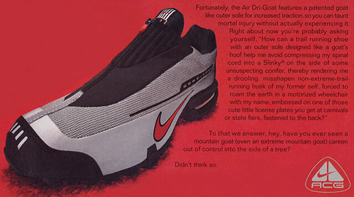
This design is far from beautiful, but we still thought we would highlight it. This is a design with no purpose whatsoever.
Nike released this advertisement in 2000 to promote their new running shoe called the Air Dri-Goat. As stated in the ad, the shoe “features a patented goat-like outer sole for increased traction”. The text could have simply stopped there and been an effective enough ad.
However, the ad does not stop there with its text. The ad does not really promote the shoe. Rather, the ad ridicules disabled people, going off on a long text spiral. We will not repeat the exact text; it is incredibly insulting to the disabled population and should not be used in any context and definitely not in an advertisement seen by thousands of people.
This text was likely meant to demonstrate the resilience of the shoe in the way that a goat is resilient on a mountain. However, the ad executed the message in a very poor and unnecessary way.
We do not have much more to say about this advertisement other than how demeaning it is. Isolating a group of people in your campaign can certainly happen accidentally. With that in mind, there is no excuse for doing so in such a deliberate and shameful manner.
Nike released several apologies for this advertisement, but in the end, company executives still approved the design before considering the consequences to their company image. This advertisement design truly served no purpose.
Conclusion
Before you unveil your advertisement or begin your new campaign, ask yourself: will this be simple enough for my target audience to understand? Could this potentially be insulting to a group of people? Are you accurately selling or conveying your product or service?
Having a beautiful design for your advertisement is important. However, it is just as important, if not more, to consider what your ad is saying and whether or not it is showcasing what you want it to.
There are still many other errors companies can make with their advertising choices. Join us again in several weeks when we discuss our next topic in this series, “Be Considerate of Your Target Audience”.